
Day2
Infographic Design
Day2 are a London-based furniture consulting company, offering an end-to-end service for the procurement, installation, and recycling of business furniture.
In January 2024, I was tasked with updating the infographic which summarises their broad offering – making it more design-led and giving it a more professional feel.
Early Developments
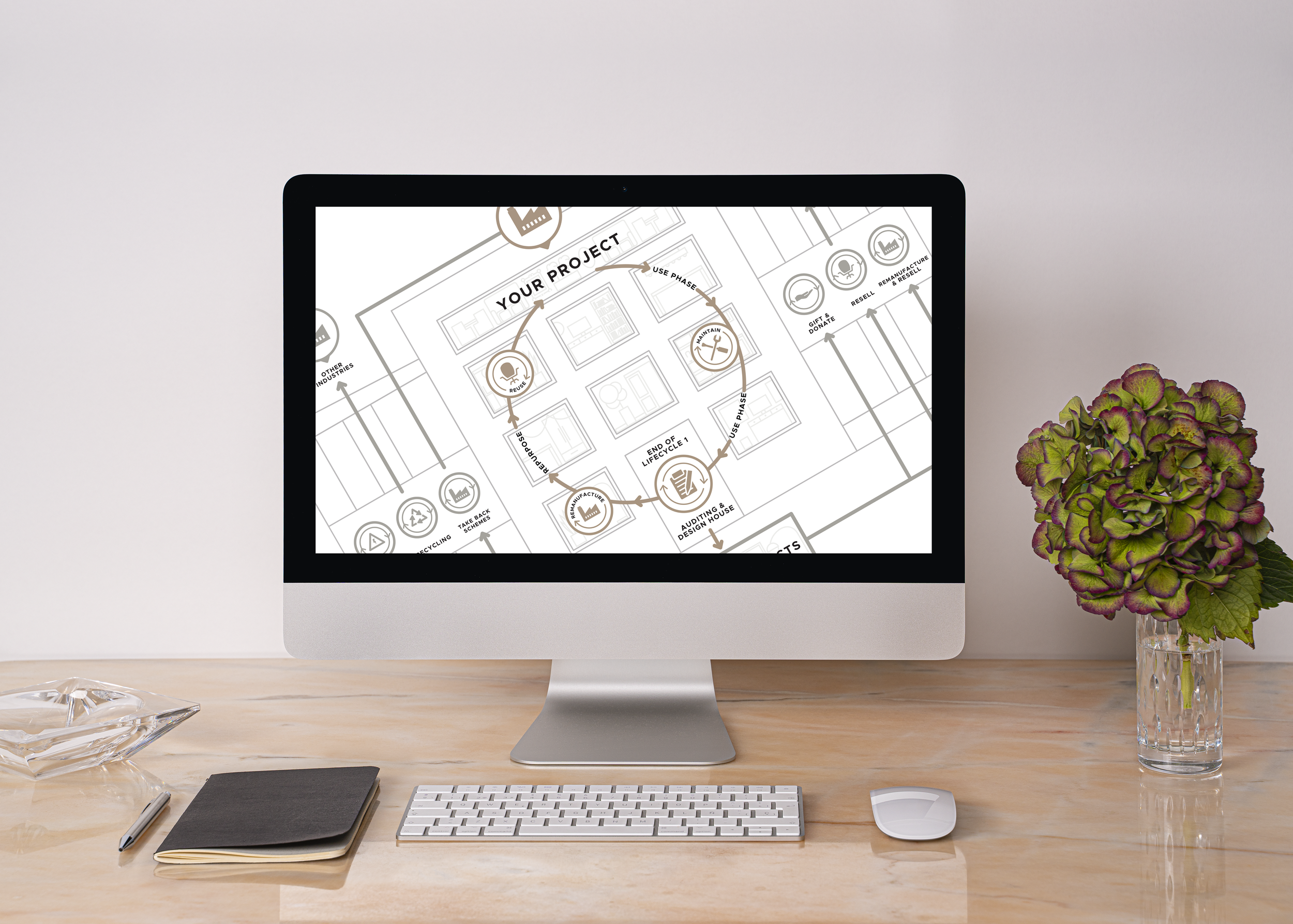
Day2 shared their current diagram with me and explained what they felt worked well, and where improvements were needed. It was clear that there was a lot of detail to summarise and visualise in a clear and coherent format.
While their current infographic summarised their broad business offering, I had to find a way to make the visual more modern and premium, while also adding clarity to the distinctive alternative routes available to businesses when working with Day2.
Having spent some time exploring options, I sent over a rough sketch of my preferred design idea, created in Procreate on the iPad Pro; to use the outline of a building to add structure and sectioning to the information.
Initial Vector Design
Once I had sign-off on the sketch, I created the first draft of the infographic as a vector; creating the building structure, the iconography graphics, and the type layout. Day2 had shared their style sheet and brand guidelines with me, so I worked within their colour palette and typefaces to ensure the diagram would adhere to the their brand guidelines.
The diagram above was sent to the client for review and feedback. Following discussion, we agreed that the furniture and plants within the windows in their current form made the image too ‘busy’, and that the building structure was too prominent. I developed the image further; knocking back the opacity of the background items, upping the weighting on the text, and removing some of the structure detail on the outside sections of the building, to give the three icons on each side more standout.
Final Design
Following further discussion with the client, we agreed I would simplify the design a little further before sending over the final files in both a white and a black version. The designs were both saved out as transparent pngs, to allow the client to place them on top of various background tones.
“Graeme took the time to listen to what we needed and understand our priorities. He was really responsive at each stage of the project, and a pleasure to work with. I wouldn't hesitate to work with him again and would highly recommend him!”
- Amy Davies, Operations Director at Day 2 Interiors Ltd.
Have a workflow or complicated system you wish to visualise? Drop me an email for a no obligation discussion about how I can help.